How to write a great lab report
To understand how to write a great lab report, first we have to understand what the purpose of a lab report actually is. After all, as a first or second year undergraduate, you’re not exactly undertaking ground-breaking research or reinventing the wheel. The purpose of the labs is to give you:
- hands-on, practical experience in a laboratory setting that you may never have encountered before,
- a glimpse of the sort of preparation and planning that goes into running an experiment, and
- knowledge of how to record your results and treat them.
So with that in mind, we can see that the purpose of a lab report must be to prove to the reader that a) you can describe what you did, b) you know why you did it, and c) what the results actually mean. In general, you’ll follow the structure of an academic paper (abstract -> introduction -> method -> results -> discussion/error analysis -> conclusions) although not to the same level of detail. The lab report you produce must stand independently of both your lab book, and the original instruction brief you were given, so while you’re writing, do so with the assumption that your reader will not have access to either of those documents.
This guide is going to be quite long, so we’ll split it into several parts. The first will be the steps you can take before you even start writing your report. Then we’ll discuss what actually goes into a lab report (and what doesn’t). After that, we’ll cover all aspects of presentation, from figures and tables, to references and citations. As you go through, keep notes on key points you want to remember to check in your own work. We could provide a checklist for you, but you’ll remember the points far better and understand them more if you write them out yourself.
Things to know before you start writing
The most common misconceptions
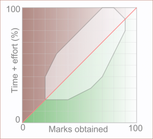
Figure 1: Time and effort spent on a lab report, and how it translates to marks.
It’s really easy to invest your efforts in the wrong directions when you write a lab report, and get poor marks as a result. One of the most common misconceptions that students have in labs is that the marks they get for their report are proportional to the time + effort they put in. You can see this in Fig. 1, where the red line shows how most students think it works, which usually leads the student to believe that if they simply put more hours (and/or more pages) into their report, they’ll get better marks. This is seldom how it works in reality.
Actually at the low end of the scale, it’s true that the marks you get are more-or-less proportional to the effort you put in. At the higher end, it’s almost impossible to get 100%, because there’s always something you can do better. Based on my own years of experience in marking lab reports, the majority of students sit in the pale bounded blob in the middle of the graph. The region of this blob above the red line represents those students who put in a lot of effort (but who get lower marks), while the region below shows students who get better marks for less overall effort/time invested (which is where you want to be). At the start of term there are always more students on the brown side of the blob, but moving to the green side requires working smarter, not harder.
For your first lab report
Once you understand what’s expected of you, you will find it’s actually very easy to do well with surprisingly little effort. To that end, the first thing you want to do is make sure you thoroughly read and digest any documents you’re given, especially if they actually tell you what the breakdown of marks is for each section. This will give you a really big hint about where to focus your attention, and also what they’re expecting in terms of presentation and page limits, etc.
Secondly, if there’s anything unclear or not specified, you should make the use of the lab time to ask whoever is overseeing your experiment to clarify the instructions for you. This is also great training for the real world; double-checking something you’re not sure about before you start working on it means you don’t have to waste hours of your life re-doing the same work again (“measure twice, cut once” as the saying goes). The students who perform the best are always those who engage with the course and ask questions.
For subsequent lab reports
Once you get your first lab report back, after it’s been marked, you’ll have a good idea of where you sit on the graph in Fig. 1. You will usually be given some general written feedback with your lab report. Paying close attention to this feedback is an important first step in improving your future work. Compare the feedback to your report (and lab book) to see where you went wrong, so you can avoid making the same mistakes next time. If you’re not sure, or don’t understand the feedback you’ve been given, you can ask the marker for a bit more detail during a quiet moment in the next lab session (or make an appointment to see them during their office hours). If you spent your time and energy working on the wrong things, the marker should be happy to help you understand where to direct your focus instead. Just remember to be polite, even if you’re disappointed with the mark you got.
Finding some real-life examples
If you want to see how real academic papers look in your subject area, and how the content is arranged and presented, you can look up examples online. Although it’s definitely worth doing, be aware that journal articles are not written with undergraduates as the target audience, so don’t be dismayed if you don’t understand it. Just have a look at how they’re presented, how the tables and figures look, etc. To do this you can use websites like the NASA ADS Abstract Service where you can easily search for the names of your lecturers to view papers they’ve published. If the final published versions are behind journal paywalls, you may still be able to freely access them via your University’s library services, if your University has a subscription to the journal. Otherwise, the search results will usually also contain links to arXiv (pronounced “archive”) where you can freely view the pre-print version (largely the same as the published version, but with occasional typos and similar copy errors). If you can’t access any papers from your subject area via NASA ADS, you can ask your course organiser or local, friendly Ph.D. students for help in that area as well. If there is one thing academics love, it’s talking about their research, so they’ll be more than happy to send you a copy of any papers they’ve published.
Writing your report
Obviously, the exact content you put into your report will depend upon your University, department, course, and specific experiment, and instructions provided by your lab organiser will naturally take precedence over anything included in this guide. However, the underlying approach to report writing is the same across the sciences, and it is the writing that most students struggle with. Provided you kept good enough notes in your lab book, some sections (like the method) should be straightforward to complete. Just remember: the page limit is not a target, so don’t feel like you need to include pages upon pages of waffle to make it look more important. You won’t get marks for anything that isn’t relevant (you may even lose marks for excessive waffling!), so keep it concise. Now, let’s get started with an overview of what goes in each section, and the most common mistakes students make in each.
Abstract: The abstract should be a very brief textual summary of the key points from all the sections in your report, so this is the section you should write last. Usually, this section should only be a few hundred words in length (ideally about half a page or less). Always include a brief description of the aims, the experiment, your key findings (especially numerical results, with error values), and your conclusions. In some real research papers you’ll see abstracts laid out more-or-less as this part of the article is, with each section on its own line and led by the section title – it depends on the research area, but the actual layout is usually not important as long as you’ve hit all the important points, content-wise.
Introduction/Theoretical background: This is the part of the report where students tend to spend a lot of time, but pick up comparatively few marks for their effort. The point of this section is not to do a deep-dive down the Wikipedia rabbit hole, but rather to provide context for the reader. Introduce the key concepts and equations upon which the experiment is predicated so they can understand the rest of the report. Explain how the equations are related and how the experiment is expected to show this relationship (this is not applicable to every subject area, but you get the idea). Let the reader know what the point of the experiment is, and what you aim to find out. Many students make the mistake of trying to just reword the brief they’re given (or worse, Wikipedia), but the purpose of the report is to demonstrate your understanding, not someone else’s. No matter how well you think you’ve reworded it, if you just stick to what’s in the brief you’re going to lose a hefty chunk of marks (at best) and get in trouble for plagiarism (at worst).
Another common mistake that students make (especially if they’re trying to get good marks) is going way overboard with the amount of detail they include. This section doesn’t really need (usually) to be longer than a couple of pages, and if possible, fewer than that. If you write a 10 page introduction, you’re essentially wasting hours or days of your life that you could spend doing something else, and for very little return on your investment. The absolute best lab report I’ve ever read was only two pages long in total, and contained every key element that a great lab report should contain. That’s not to say that every lab report should be only two pages long, but if all the content is there, it’s not necessary to add anything extra.
Method: This is arguably the easiest part. Remember that reproducibility is one of the foundations of modern science, so in this section you need to describe what you did in sufficient detail that any reader of your report could reconstruct the experiment exactly as you did it, and obtain the same results. The key mistake most people make in this section is that they approach it as though they’re writing an instruction manual (or they just reword the instructions they got from the brief), but that’s not the purpose of this section. You should include details of the exact equipment you used, but the most important thing is the design of the experiment, so describe how you set up and performed it. If you include diagrams here, make sure you label each part clearly (otherwise it’s worthless) and if you lift diagrams from the brief, reference the original source of the image – usually this will be the manufacturer’s catalogue or website, and not your lab instructions. If you used a particular technique in your analysis, you should also describe it in this section. Every single part of what you’ve done should be transparently clear for the reader.
Results: The advice I always give students with respect to their results is to avoid using tables to display their data unless absolutely necessary. A well-constructed graph is always more visually impactful and gives the reader an instant understanding of what the data show. If you really want to use data tables, they are usually better off in an appendix at the back of the report. The only time you should even consider using a table is to show something that would otherwise be confusing or untidy if it were written in a paragraph (i.e., to summarise some parameter set). When you are creating your graphs, make sure you include the usual expected elements:
- Axis labels with units;
- Sensible data ranges (if data on the axis range from 100-150, you don’t need to start the axis from 0);
- A legend, if you have more than one set of data on the graph;
- Error bars; and,
- Captions (which should have the figure number and a description of what the graph shows).
Not including one or more of these elements in the figures is the most common mistake that students make in this section, along with forgetting to include units and errors when stating numerical results. These are very easy marks to lose, so make sure you read the report through before you hand it in and look for missing units and errors. Even better, swap with a friend who’s doing a different experiment and read each others’ reports. It’s much easier to spot errors in writing you’re not familiar with.
Discussion: It’s easy to do poorly in this section, especially if you spend all your energy on the previous sections (and run out of time), because the results and discussion sections are usually where you’ll pick up the bulk of your marks. These sections are also more difficult because, unfortunately, they do require you to actually think about the results you obtained. The relationship between the amount of waffle in a report and the level of understanding of the author is inversely proportional, so it’s impossible to bluff your way into a good mark. For this reason, I recommend writing the previous sections as soon as possible after your lab sessions (you can begin typing up the basic details of your method as soon as you finish the first session!). If you do this you will have a lot more time to consider your results and what they mean, and you won’t have to try and write the whole report at the last minute. If you do leave this section til the last minute, you will find it way harder to actually discuss your findings and end up writing “pages of nothing”, in the hopes of picking up some marks by accident. I guarantee this won’t work.
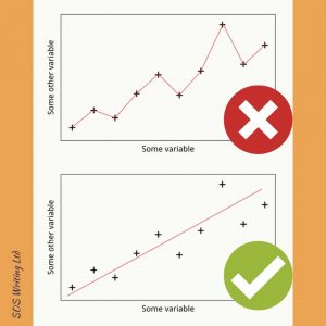
Figure 2: There is definitely a right and a wrong way to analyse your data. Never connect your data points (either with lines or splines). If you’re expecting a linear relationship then a line of best fit is OK, but linear regression is better.
When you discuss your results, make sure you reference each graph by its figure number (“absolute referencing”) and avoid saying things like “in the figure below”. In the course of your writing, your figures can become very badly behaved and start wandering around all over the place! Every figure you include should be discussed somewhere in the text – if you have figures you don’t discuss then they’re basically useless appendages, and you might as well take them out (like an appendectomy).
Let’s have a look at Fig. 2 as an example of the right and wrong way to analyse a figure. On the top, you can see a common mistake made by students, especially if they’re using Excel for their data analysis. They often connect each of their data points, either with lines or splines, but this approach doesn’t really tell you anything beyond “as some variable increases, some other variable does too”. This is a qualitative description of literally what the graph shows, but it’s not a very deep or insightful statement, and it doesn’t tell us anything about the science underlying the results. A basic quantitative approach would be to think about the expected relationship based on the key equations the experiment is based on. Let’s say that the relationship is expected to be linear, and let’s recognise that the data points appear to show a linear relationship. At this point, we can then calculate a line of best fit to find out the gradient – then you know by how much “some other variable” increases as a function of “some variable”, and can then discuss the degree to which your results agree with the theory. Even better might be to perform linear regression, which would also give you an estimate of the gradient, but would also tell you how tightly correlated the variables are, and thus how good the fit is. Having a chat with your lab helper about the analysis you want to do will help a great deal, so start working on your analysis early and get some advice/feedback about whether it’s appropriate for your work.
Usually, the difference between high- and low-scoring reports comes down to the level of quantitative analysis undertaken. In other words, do you describe a relationship between your variables based on how the graph looks, or have you tried to find out what the relationship actually is? To get the most out of your discussion, you want to try to think about the variables you’ve plotted together, and how they compare to the theoretical values you expected. Do your experimental results make sense? Can you see any sort of consistent shifts in your results that might indicate an experimental bias? What are the implications of your results? These questions are by no means an exhaustive list, but are a good starting point to get you thinking about what your results actually mean.
The specific type of analysis you might do will depend largely upon your research area, and getting advice from the lab helper running your experiment is a good place to start. Ask yourself as well if your analysis makes sense – for example, if you say that your results appear to show an exponential relationship, is there an exponential term in the equations underpinning the experiment? If not, it could be that you’ve misinterpreted your results. Remember that scientific and mathematical terms have very specific meanings, and if you’re not sure if you’re using them correctly, it’s easy enough to look them up and find out.
Error analysis: Sometimes, this section will form part of your discussion, and sometimes it may be appropriate to treat it separately. I’m not going to cover the details of how to actually perform your error analysis, since that deserves a guide all by itself, but you should be instructed by your institution in how to identify and deal with errors. Really take the time to work through whatever you are given, and try to understand it. It’s worth taking the time, because this section is usually worth a lot of marks.
For the purposes of your lab report, you want to demonstrate that you have a) thought about all the possible sources of errors in your experiment, b) understand what type of errors they are and c) how to sensibly estimate/correctly propagate them (as appropriate). If you don’t know the difference between a systematic and a random (stochastic) error, you need to clear this up while you’re in the labs by talking to the lab helpers. Error analysis is a topic that often confuses students when they first encounter it, so don’t feel nervous about asking for help.
If you have to calculate any propagated errors, check that your resulting error bars seem to be in a sensible range compared to your values. If they’re multiple orders of magnitude different, you may have made a mistake! It’s usually OK to plug the formula into your spreadsheet and have the computer calculate the errors for you for all your values, but if you do this you must show an example of your calculation in the report. This is actually a good way to make sure your automatically calculated errors are correct. All other errors (i.e., non-calculated ones) must be stated in your report, and you need to justify how you chose them.
Conclusion: Just as with the abstract, the conclusion is a summary of the whole report, but they can’t just be a copy/paste of each other. Start by summarising the aims and methods in a couple of sentences to remind the reader, and then bring together your key results and discussion into a neatly packaged summary. If there were any differences between your results and what was expected, you should also mention here what those differences were and why they occurred. You may also want to mention, if things did go very wrong, what you would have done differently to ensure a successful outcome. Provided you can discuss what went wrong and how it could be fixed (which is evidence of critical thinking), there’s no reason to think an unsuccessful experiment must lead to a low mark.
References: Any reputable institution will take academic integrity incredibly seriously, so you must make sure that you reference correctly or you could fall foul of rules about plagiarism. The rules should be made clear to you at the start of your degree, or at least, at the start of any module or course where you may need to reference external sources. “I didn’t know that” will not be accepted as a defence if you get pulled up for plagiarism and the penalties can be high (like the case of a German education minister ironically being stripped of their doctorate for plagiarising part of their thesis). In plain terms, referencing means making it clear exactly what is, and what is not, your own work. So if you paraphrase a piece of text written by someone else, you must include a citation next to the text you’ve paraphrased to show the source of your information, and the full reference in your reference list, which shows the reader where they can find the original text. Direct quotes have to be enclosed in quotation marks and cited.
You also have to cite and reference specific information or data that you obtain from elsewhere, and you have to cite the original source of the data, which may not be the same as the place where you found it. Chasing down sources is often one of the most frustrating and time consuming parts of referencing, but it’s necessary. Your source may not say the same thing as the original source, and you can’t just take their word for it (this is especially true in the case of clickbait headlines and fake “science journalism” from certain social media outlets). You want to make sure you only cite reputable (and preferably peer-reviewed) sources, and tracking down the original source is the best way to do this. Wikipedia is fine as a starting point for research on a new topic, but you never want to include it in your reference list. Literally anyone can edit it.
Say, for example, that your piece of equipment has an operating manual provided by the manufacturer, and this has all the technical specifications/parameter values. The relevant ones may be included in your lab instructions. In this situation, you will need to look up the manufacturer’s manual (or data sheet) – usually this will be in the lab – and take the values from there directly, making sure to cite and reference the operating manual and not your lab instructions. As for how to actually show your citations and references, this will be covered in the next part of this guide.
Next article
How to present your lab report or go back to Guides